Sep 23, 2025
في هذه القناة ستجد مقاطع فيديو تغطي مواضيع متنوعة مثل الشبكات، الأمان السيبراني، أنظمة التشغيل، والعديد من المواضيع الأخرى التي تهدف إلى تعزيز المفاهيم الأساسية في هذه المجالات .
On this channel, you'll find videos covering a variety of topics, including networking, cybersecurity, operating systems, and many other topics aimed at reinforcing basic concepts in these fields.
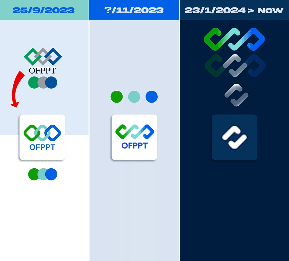
تطور شعار قناة OFPPT:
25/9/2023:
الوصف: الشعار الأصلي يتكون من ثلاثة عناصر متشابكة بألوان الأخضر، الرمادي، والأزرق، مع النص "OFPPT" تحته.
التحسينات: تم تحسين الألوان لتكون أكثر حيوية واستخدام تدرجات لونية أكثر إشراقًا، مع إضافة خلفية بيضاء لتعزيز وضوح الشعار.
7/11/2023:
الوصف: تم تبسيط الشعار مع الحفاظ على العناصر المتشابكة الثلاثة، وتحسين الألوان لتكون أكثر تناسقًا وجاذبية.
التحسينات: النص "OFPPT" أصبح أكثر تناسبًا مع الشعار، مما يعزز التوازن البصري للشعار ويجعله أكثر وضوحًا وحداثة.
23/1/2024 > الآن:
الوصف: الشعار الجديد يتميز بعناصر متشابكة مصممة بأسلوب أكثر حداثة وانسيابية، مع استخدام تدرجات لونية أكثر تناغمًا.
التحسينات: الشعار أصبح أكثر بساطة وحداثة، مع إزالة النص "OFPPT" لتركز العناصر البصرية على الرمز فقط، مما يسهل تمييز الشعار.
تحليل إضافي:
التطور الزمني: الشعار تطور من تصميم معقد ومليء بالتفاصيل إلى تصميم بسيط وحديث، مع الحفاظ على الرمزية الأساسية للعناصر المتشابكة.
الدلالات: العناصر المتشابكة تعبر عن التعاون والتكامل، مما يتناسب مع رسالة القناة في تقديم محتوى تعليمي يعزز الفهم والتعاون في مجال البنية التحتية الرقمية.
الابتكار: الانتقال إلى تصميم بسيط وفعال يعكس رغبة في التواصل البصري الفعال مع الجمهور، مع الحفاظ على هوية القناة.
استنتاج:
شعار قناة OFPPT شهد تطورًا ملحوظًا في التصميم، حيث انتقل من تصميم معقد إلى تصميم بسيط وحديث يعكس الهوية البصرية للقناة ومحتواها التعليمي. التحسينات المستمرة في الألوان والتصميم تعزز من جاذبية الشعار وتوافقه مع رسالة القناة في تقديم محتوى تعليمي مميز في مجال البنية التحتية الرقمية.
OFPPT channel logo evolution:
25/9/2023:
the description: The original logo consists of three elements intertwined in green, gray, and blue colors, with the text "OFPPT" under it.
Improvements: Colors have been improved to be more dynamic and to use brighter color gradients, with the addition of a white background to enhance logo clarity.
7/11/2023:
the description: The logo has been simplified while preserving the three interlocking elements, and improving the colors to be more consistent and attractive.
Improvements: The text "OFPPT" has become more fit with the logo, which enhances the visual balance of the logo and makes it clearer and more modern.
1/23/2024 > Now:
the description: The new logo has interlocking elements designed in a more modern and streamlined manner, with more harmonious color gradients used.
Improvements: The logo has become simpler and more modern, with the text "OFPPT" removed to focus the visual elements on the symbol only, which facilitates the identification of the logo.
Additional analysis:
Time evolution: The logo has evolved from a complex and detailed design to a simple and modern design, while maintaining the basic symbolism of interlocking elements.
Signatures: Intertwined elements express cooperation and complementarity, which is commensurate with the channel’s mission to provide educational content that enhances understanding and cooperation in the field of digital infrastructure.
Innovation: Moving to a simple and effective design that reflects a desire for effective visual communication with the public, while preserving the identity of the channel.
Conclusion:
The OFPPT logo has witnessed a remarkable development in design, moving from a complex design to a simple and modern design that reflects the channel's visual identity and educational content. Continuous color and design improvements enhance the logo's attractiveness and compatibility with the channel's message in providing distinctive educational content in the field of digital infrastructure.


skills soon…